File Sharing App #
- discovery
- ux design
- interaction design
Background
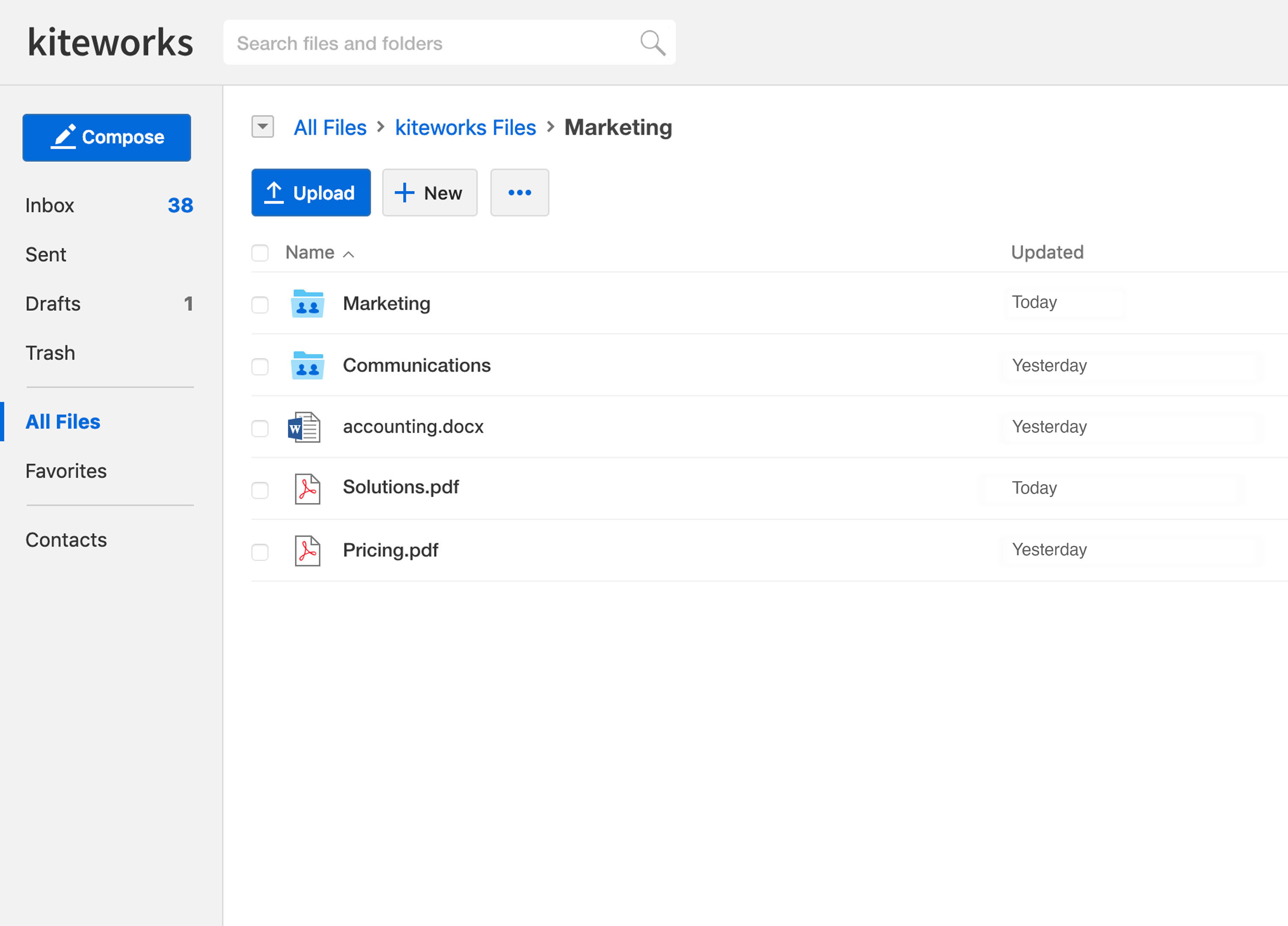
Kiteworks was founded as a secure file transfer app and gained a loyal following based its feature set and performance. Around 2014, the company launched a new product called kiteworks that focused more on folder sharing than the original product with the thought that customers of the legacy product would migrate and adapt to new ways of collaboration. Although file transfer was still part of the new product, customers complained about usability and many stayed with the aging original product rather than switching over.
Hypothesis
The kiteworks app did not initially meet the needs of customers migrating from the original file sharing application. There were several usability issues related to file sharing. A redesign of the feature is required to clarify what users can do and reduce friction throughout the task flow.
Research
As part of the discovery process and to achieve a deep understanding of customer needs and flows I helped organize and ran a week-long usability study project with a key city government customer.
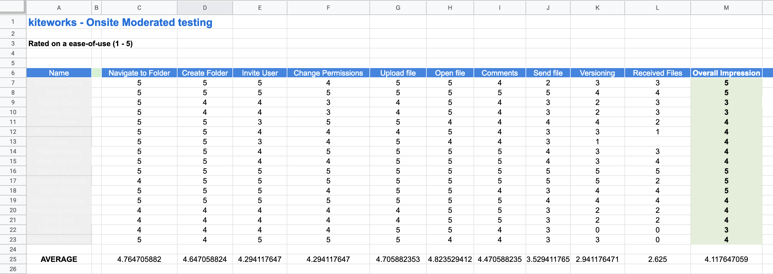
Each day I met with employees from various departments within the city: planning, police, fire, business development, IT and more. The individuals I met with had varying levels of experience using the product, from zero experience to power users. The goal of the project was to understand the behaviors and needs of a representative customer to improve the product for all customers and inform product design decisions going forward. The sessions took place in the users own environment and context to learn how they are using the product and where they are having issues. Sessions started with a casual interview followed by observation of the users going through a series of common tasks. The project revealed a wealth of issues that would not have been discovered without this deep level of testing.
Key Takeaways
- Send File icon (airplane logo) by itself in inline actions on files was not clear to users.
- Received files hidden under the Send Files drop down. Users didn’t expect to find it there.
Sketching/Prototyping
Based on feedback I decided to test a clear, unambiguous call-to-action in the menu for messaging vs a navigation label that also functioned as an action.
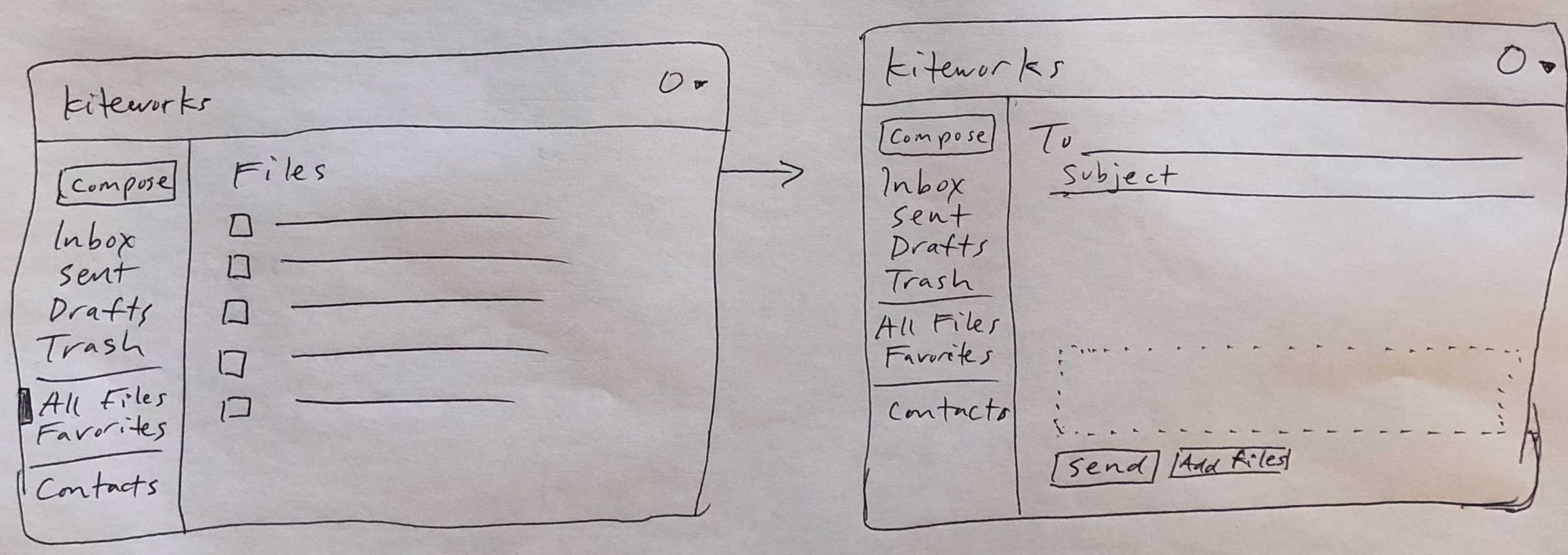
Next step was to build a clickable prototype and run it by customers. I conducted approximately 10 interviews (primarily over webex) with a variety of customers, gathering feedback and making small iterations. Example open question was how to visualize files being processed and in transit - and how to handle errors (ie outbox or no outbox.)
Development
I worked very closely with the front-end development to build out the production version and fine-tuned as we went a long.
Outcome
I moved to a different company shortly after new version was rolled out to customers so unable to get quantitative measurements on success. However according to my contacts there the changes were a great success. The new paradigm has been extended to forms and requesting files.
Quotes from kiteworks users (after upgrade):
- "Kiteworks – is a fantastic app that provides secure data sharing for enterprise organizations."
- "Like any other user, I definitely appreciate a clean and intuitive interface, which makes the usage of the app as simple as one can be."
- "Efficient Secure User-Friendly Platform To Share Files. Kiteworks is an amazing app that allows you to transfer file efficient and in a very user friendly way. It has the capacity to support heavy file transfer with utmost ease."