Amplify Landing Pages #
- discovery
- usability testing
- ux design
- interaction design
The first-time experience, especially on SaaS apps, it is of critical importance and can make or break the conversion of potential customers. With this in mind I updated the visuals and switched the main flow of the application to show things that a user can do as soon as they land. Default capabilities/apps are shown as tiles on the right, and to this I added tangible quick actions (aka jobs-that-can-be-done) on the left side in order to connect the applications with actions that bring immediate, tangible value to their org.
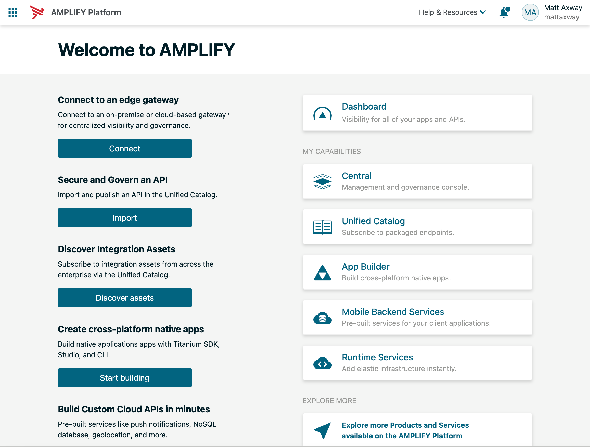
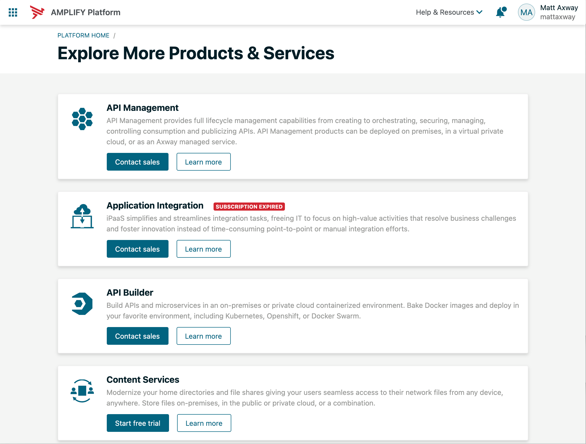
I also reduced the emphasis on the additional services an org can try and buy. There still exists a way to explore additional SAAS apps/capabilities on that page but it is more subtle (at the bottom of the page) and leads to a new page that is clearly distinct from the main flow.
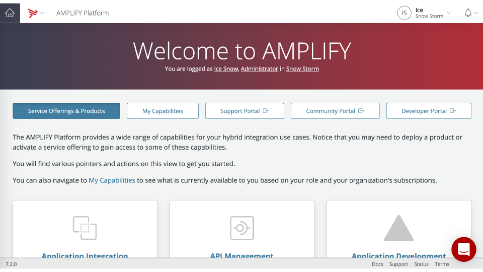
For contrast, in the previous landing experience the very first view after sign up was a page essentially trying to offer more services instead of showing what a user can actually do right now.
Landing pages will continue to evolve and improve but the feedback on these changes so far have been positive. From a metrics perspective, people are spending less time on landing which in this case indicates success, ie they are finding what they are looking for and moving to that context rather than being stuck or lost on next steps.