Syncplicity Improvements #
- discovery
- usability testing
- interaction design
The latest release of Syncplicity desktop has several improvements identified and designed by me and developed in collaboration with product and engineering. The features are related only to usability and understanding rather than the typical new technical features.
Add visual indication to show additional states of folders
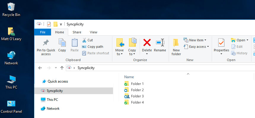
Two Syncplicity features that are very useful to end-users are the ability to Sync folders on your computer with live copies in the cloud, and also the ability to easily share folders with business colleagues and partners.
Before:
For shared folders, the end users can’t tell if the folder is synced locally or available only when online. Also, in list view it’s unclear the overlay indicating shared is distinct from the overlay indicating synced.

After:
Now for shared folders there’s an obvious person icon indicating shared status of the folder but without obscuring the sync status of the folder.
My role in this improvement was identifying the issue, designing a solution and testing the proposed solution with users prior to handing off final production assets to engineering. I worked closely with the Product Manager for Syncplicity to demo and document the end-to-end changes, and create tasks for engineering.
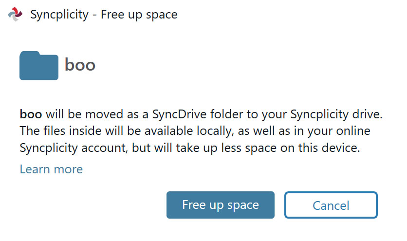
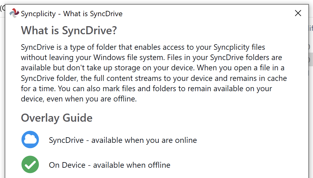
In-app product help/Content Design
In addition to creating more understanding of states of folders I also created in-app content explaining what these different states mean. When end users elect to use Syncplicity to free up space on their computers, they are presented with a popup explaining what will happen when they select the option. For those that want to learn more there is a clear text link which previously opened a long article on the web. Now it opens to a clear overlay guide without having to leave the familiar windows explorer environment.