Live Price Check
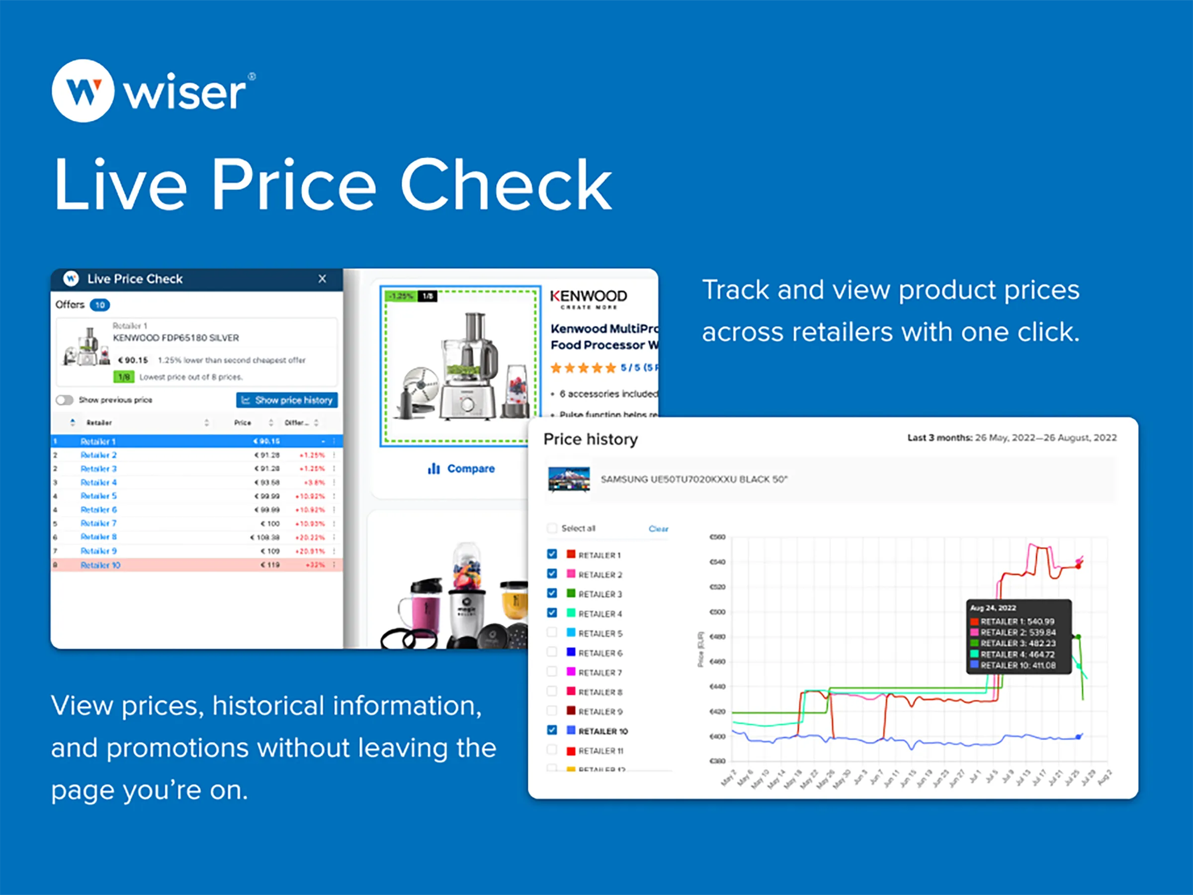
While at Wiser Solutions I did a major upgrade to the design and usability of Live Price Check. Live Price Check (LPC) is a Chrome extension that allows retailers and brands to compare prices of selected products across all the other online shopping platforms in that particular country or region-all without having to manually visit every other site where the product is sold. It also provides a price history chart to track price trends over time.
Check out Live Price Check on the Chrome Web Store
The Challenge
Although the original product has a ton of utility, it is not easy to learn and requires a lot of training by the customer success team to teach customers how to use the product.
The Process
My process was to deeply analyze the product and check against best practices in UI and user experience design. Plus a lot of research! The product manager and I talked to several customers who used the product daily and gathered their extremely insightful and valuable feedback. From there I started to create the new designs.
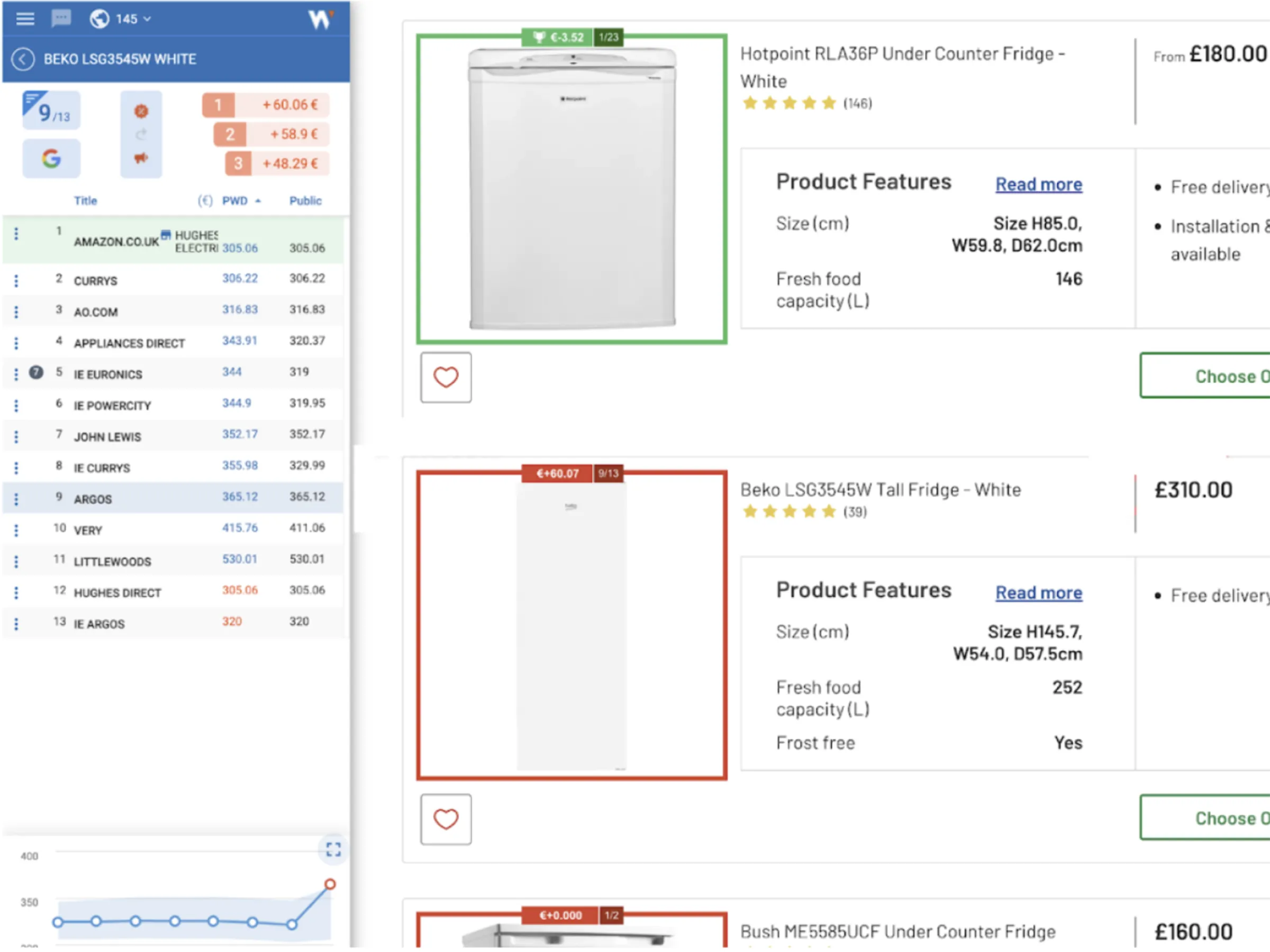
Before
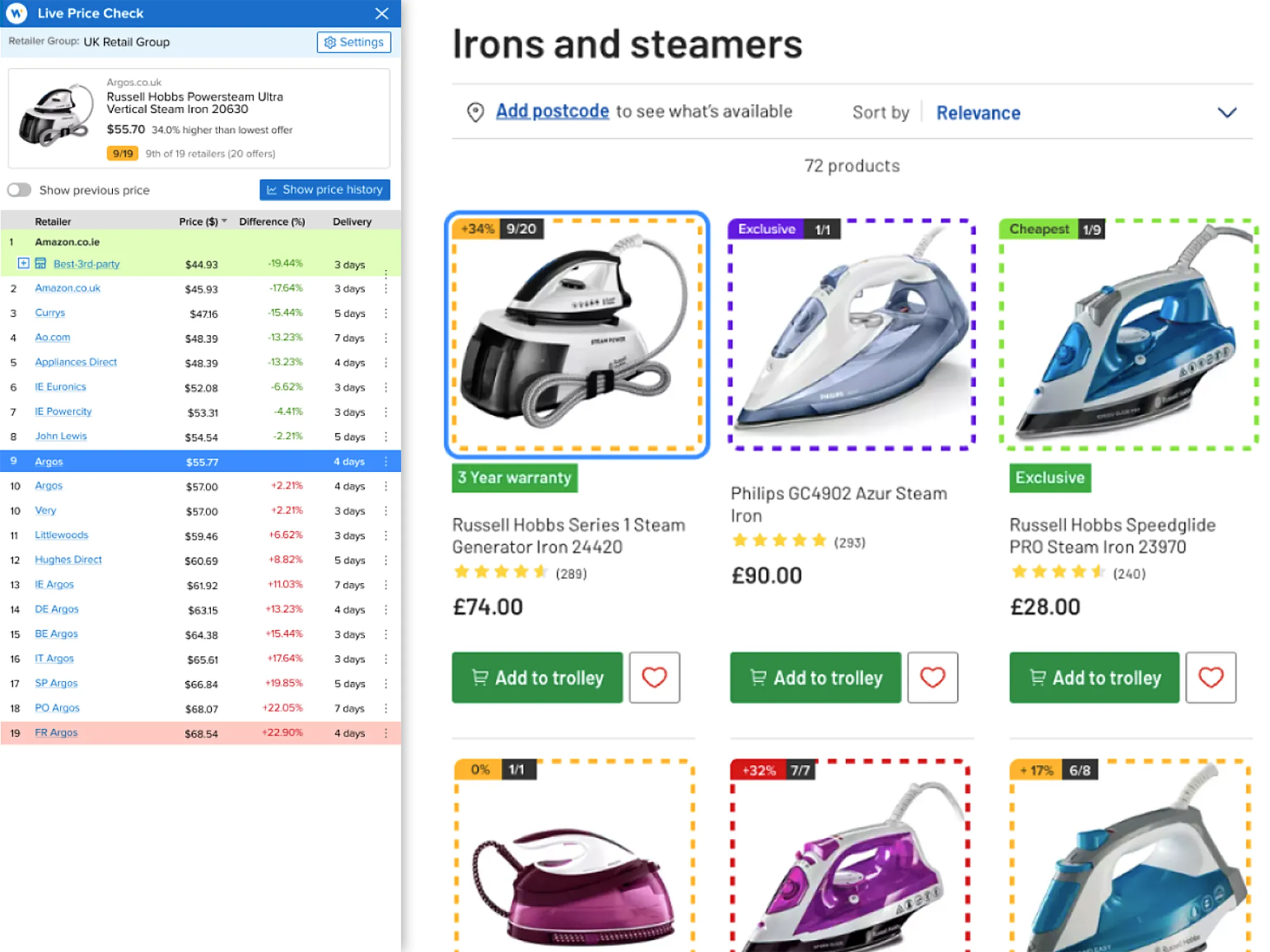
After Redesign
Key Improvements
- Added product photo to description
- Added blue frame to selected product (which is mirrored in the side panel)
- Dashed-lines around products (more obvious it’s related to the extension)
- Added amber color to indicate pricing in the middle
- Added the price delta
- Green and red coloring in side panel to indicate higher and lower prices
- Added a button to trigger the price history chart- the mini-chart at the bottom did not look clickable
- Improved readability overall:
- -Larger fonts
- -Changed text from all-caps to title or sentence-case
- -Increased contrast
Chart Before
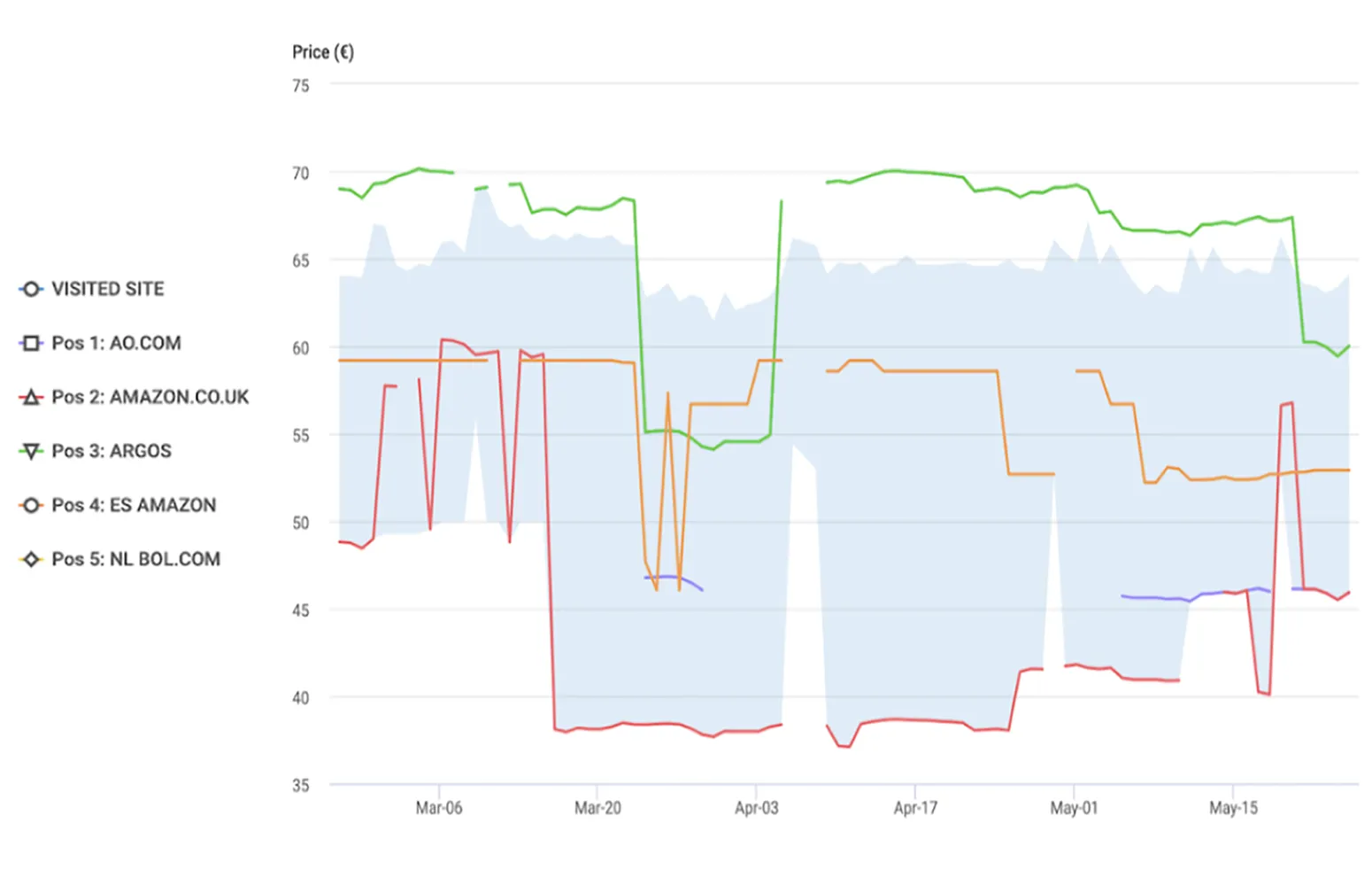
Chart After Redesign
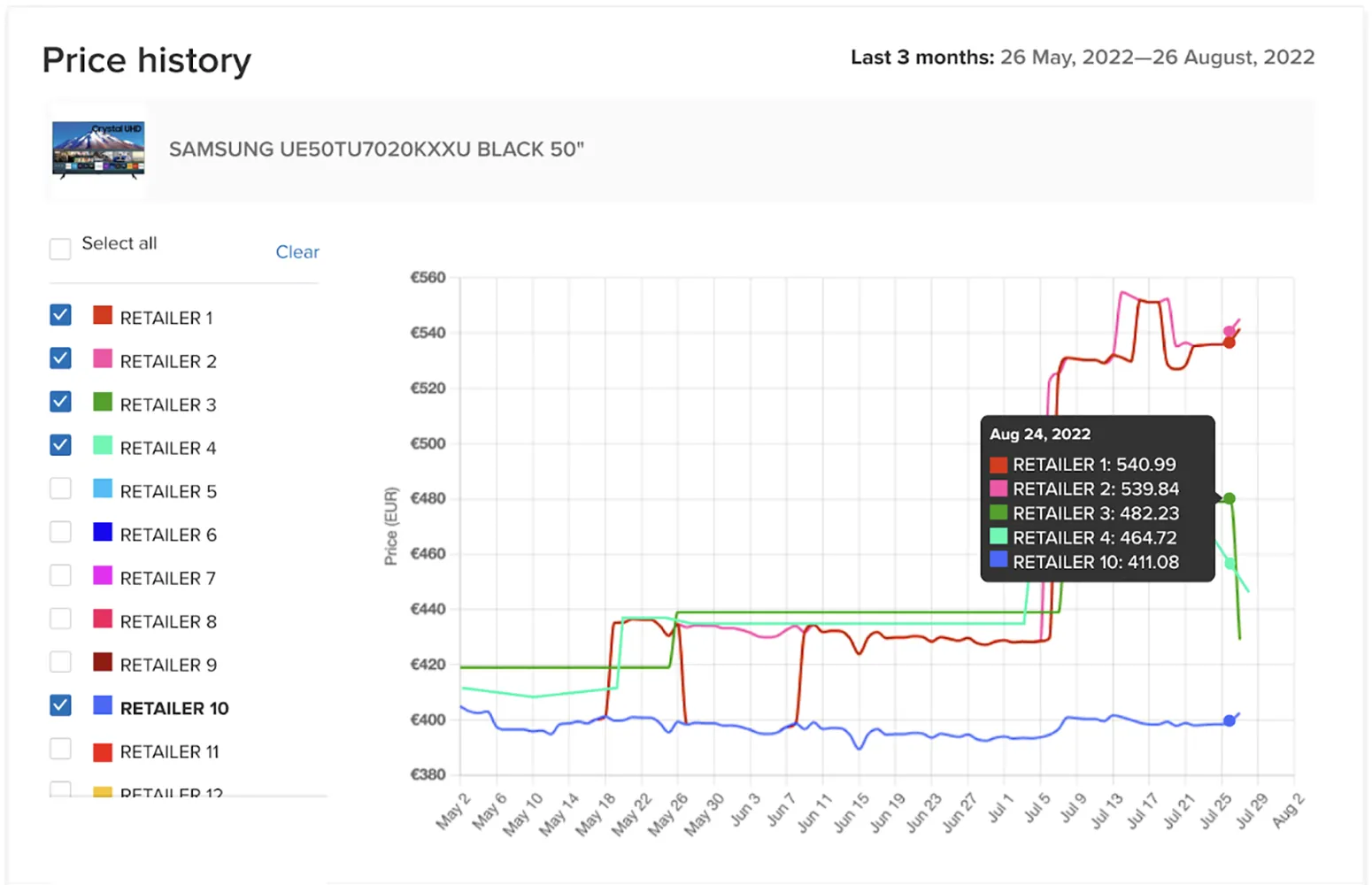
Key Improvements to Chart
- Strong splash of color to connect retailer name to line in chart
- Show selected product (picture and name) to maintain context
- Added chart title
- Added date range
- Added bold styling on selected site
Outcome
The Improvements outlined above, along with other improvements, resulted in:
- Delighted customers! One customer for example called the changes to the way the product rankings are displayed as "Brilliant!"
- Less "hand-holding" by support staff because the extension is now way more self-explanatory/intuitive resulting in an about a 50% drop in support tickets related to how to use the extension.