Case Study
Packaging Production
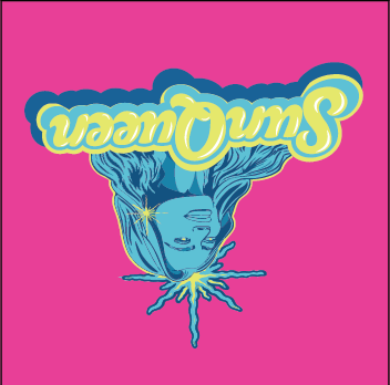
- Client
- Private Label Mineral Sunscreen & Skincare Manufacturer
- Deliverables
- Outer Carton · Primary Carton · Bottle Label
- Role
- Production Designer
- Result
- On time · On budget · Press approved
- Date
- March 2026
Overview
A private label mineral sunscreen and skincare manufacturer contracted me to design and produce three distinct print-ready packaging components for a new product line: an outer shipping carton, a primary retail carton, and a wraparound bottle label. The work covered the full design-to-production pipeline — from initial concept through FDA-compliant copy, dieline adaptation, and final press-ready file delivery.
The engagement ran efficiently through three rounds of revisions per piece, finishing on time and on budget. Client, manufacturer, and print vendors were all satisfied with the final deliverables.
Challenge
The brief arrived with minimal source material: a standalone logo, rough hand-sketched layout concepts, and Word documents containing product copy and regulatory information. There were no finished comps, no established type system, and no production templates to work from.
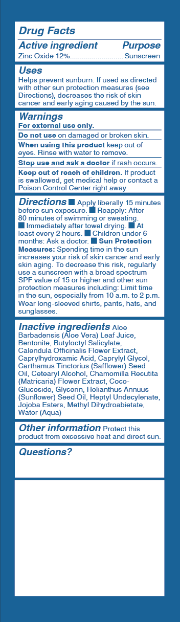
All label copy — ingredient lists, usage instructions, warnings, and net weight — had to meet FDA labeling requirements for cosmetic products. That meant accurate panel sizing, compliant type sizes, and correct information hierarchy across two carton formats and a cylinder wrap. Every layout decision had to serve both brand presentation and regulatory compliance simultaneously.
Deliverables
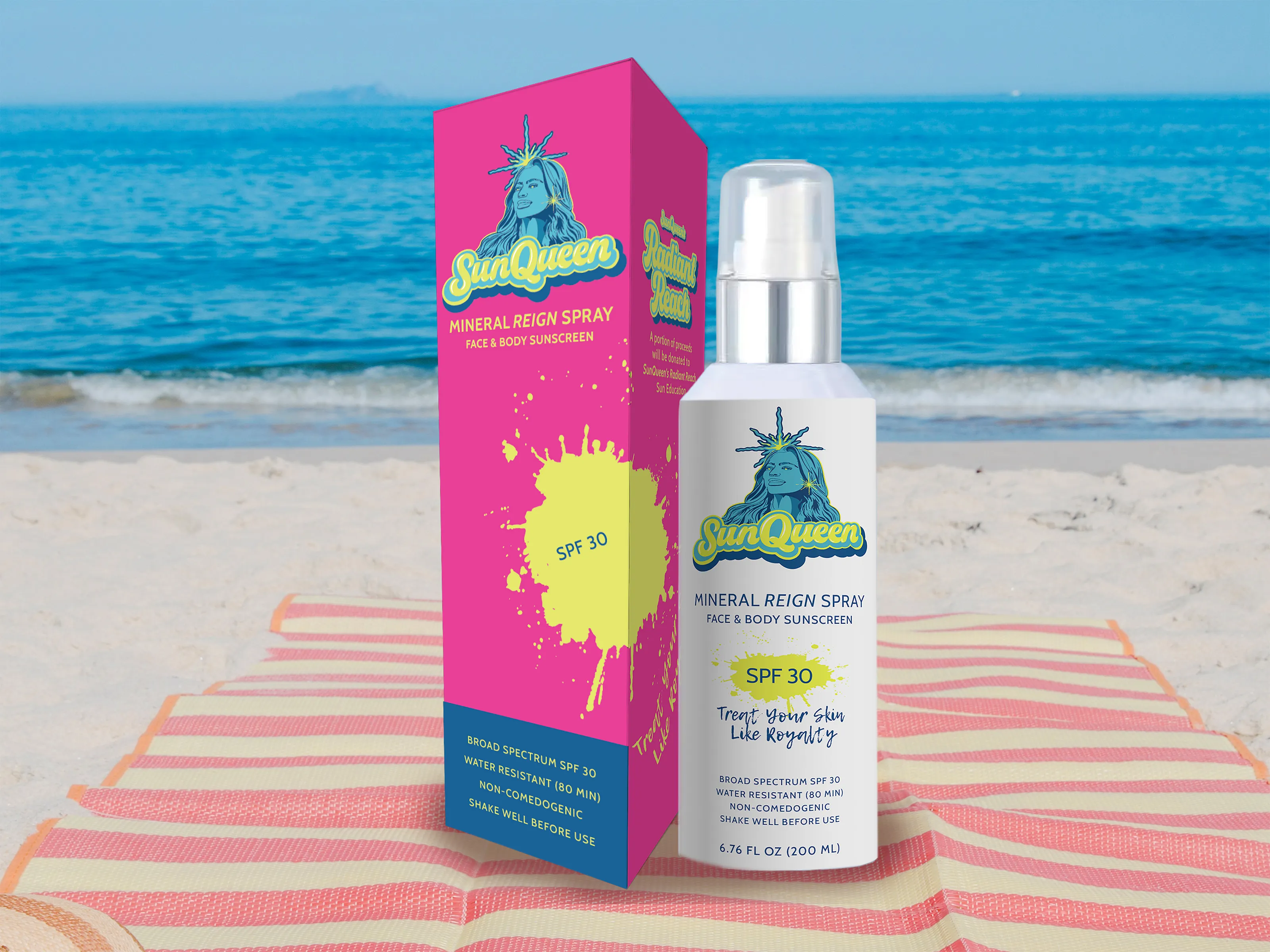
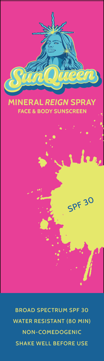
Outer / Master Carton
Shipping-spec carton for the 200 mL SKU. Full dieline development, brand graphics, and information panels set to manufacturer spec.
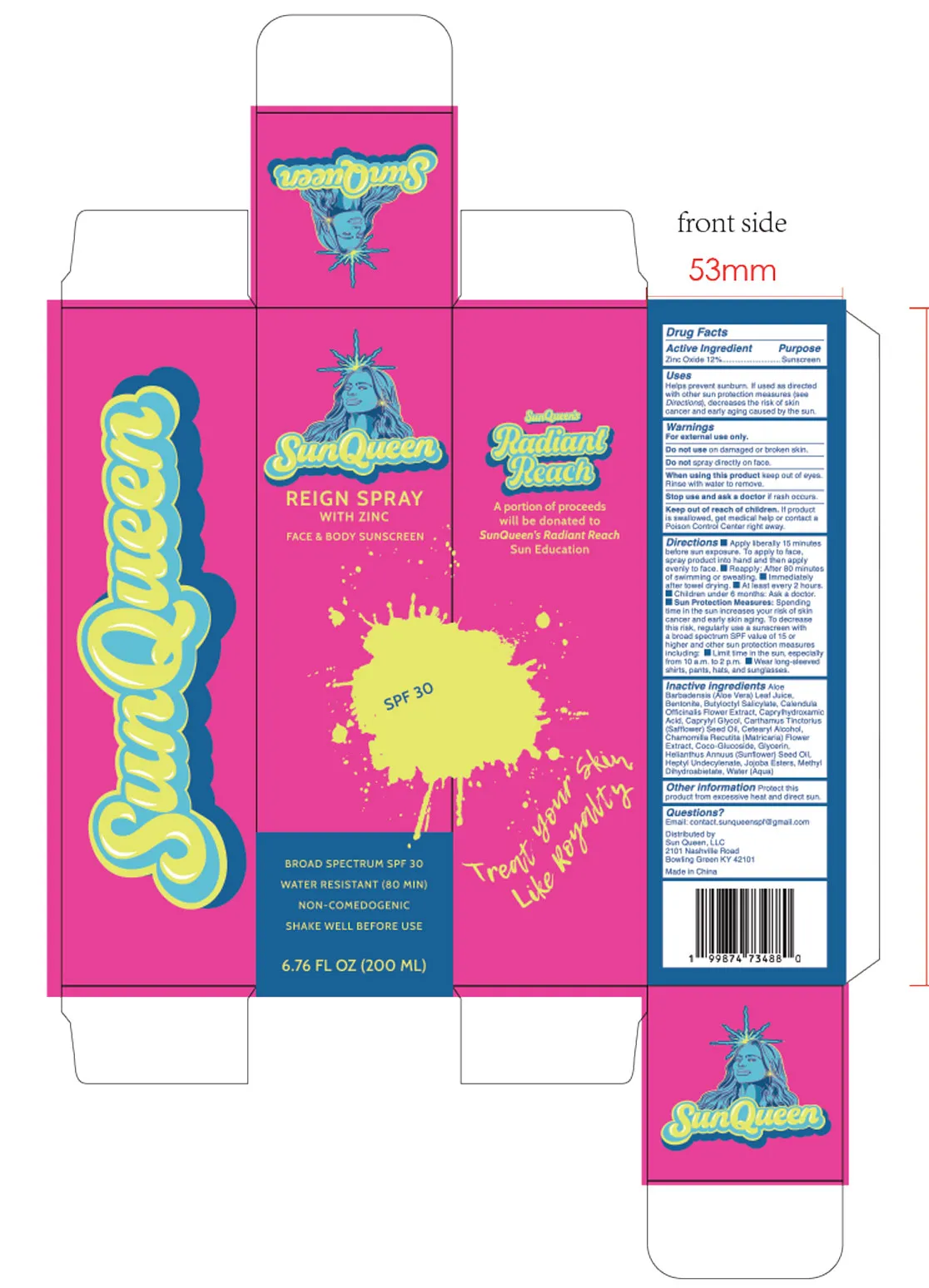
Primary Retail Carton
Consumer-facing retail carton with full brand treatment, FDA-compliant information panel, and press-ready color separation.
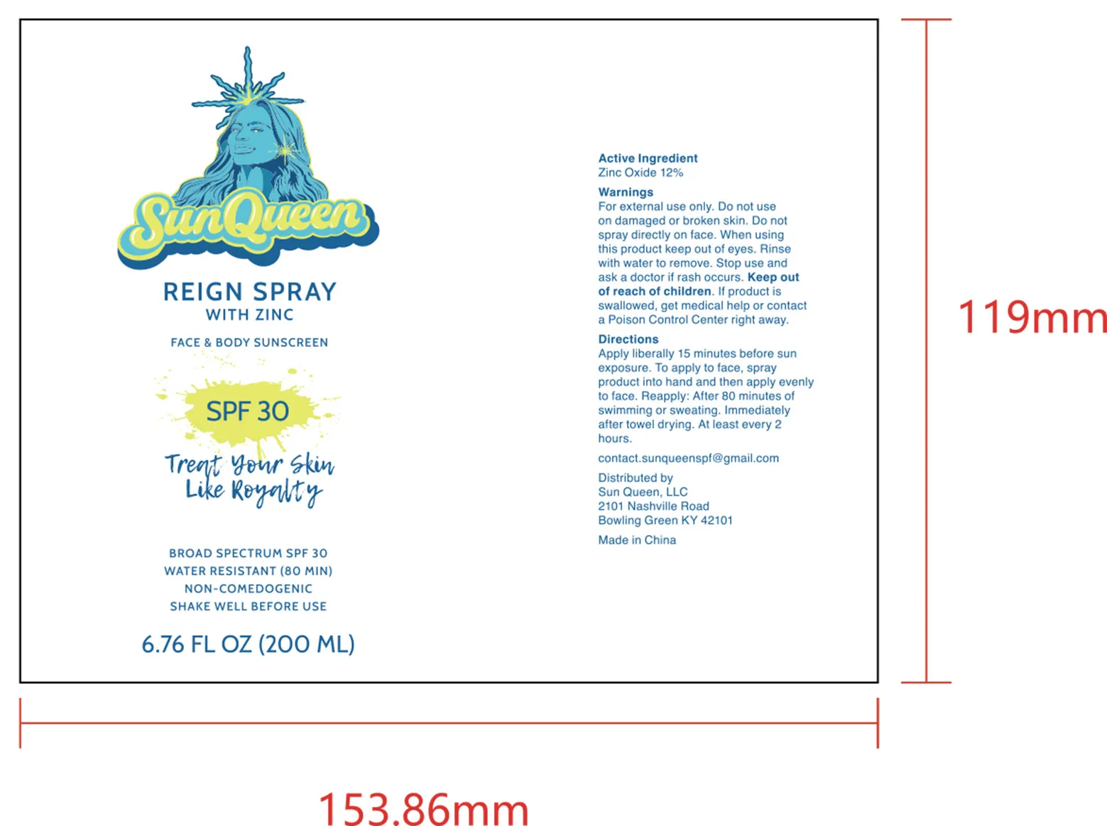
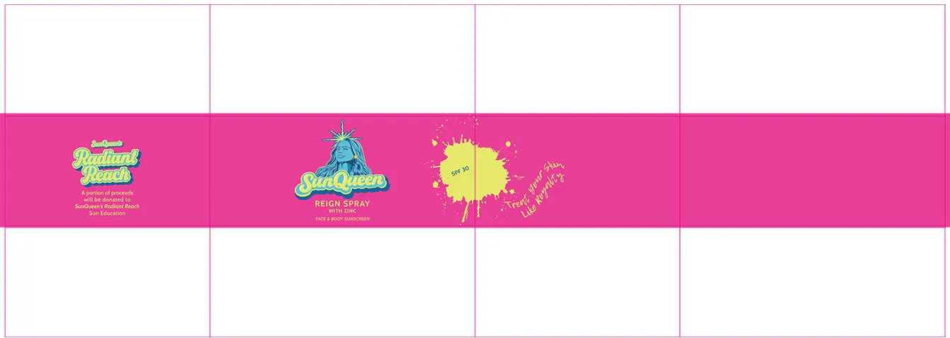
Wraparound Bottle Label
Wraparound label for the primary bottle. Designed to the exact cylinder circumference with correct overlap and bleed for the label printer.
Process
Starting from the supplied logo and rough layout sketches, I built the typographic system, established the color palette, and developed dieline templates for all three components. Regulatory copy from the client's Word documents was typeset with production precision — correct point sizes for principal display panel requirements, accurate net content statements, and correctly ordered ingredient lists.
Each piece went through three focused revision rounds. Feedback was incorporated cleanly with no scope creep, and all files were supplied to the print vendors in their required formats with correct color profiles, bleed, and trap settings.
3D Client Visualizations
Early in the project — before final art was complete — I built interactive 3D renderings of the carton and bottle and delivered them to the client. These were not finished artwork; they were visualization tools to help the client understand the spatial layout and panel relationships before committing to a direction. Being able to rotate and inspect the packaging in context made the review process faster and reduced the back-and-forth that typically comes from evaluating flat print files alone.
Primary Carton — Interactive 3D

Drag to rotate · Scroll to zoom
Bottle — Interactive 3D
Drag to rotate · Scroll to zoom
Result
All three packaging components were delivered press-ready within the project timeline and budget. The client, the private label manufacturer, and the print vendors approved the files without issue. The early-stage 3D visualizations were called out specifically as a value-add — sharing them during the design process gave the client a way to understand the packaging structure and panel layout long before final art or physical samples existed.